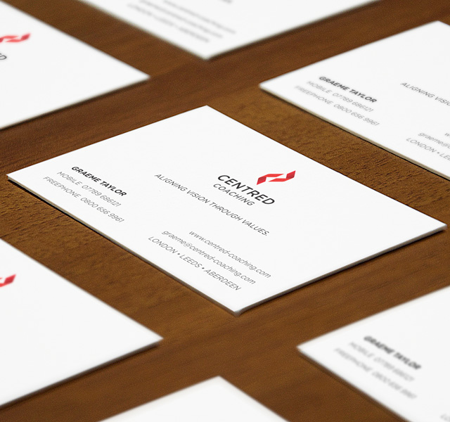
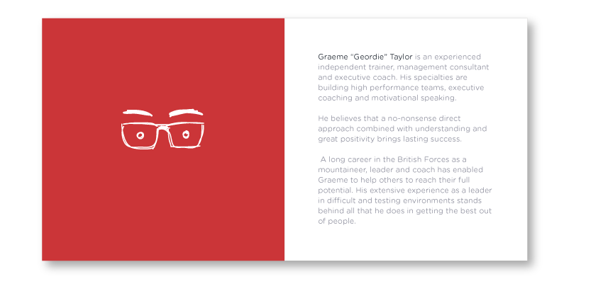
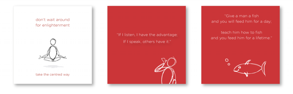
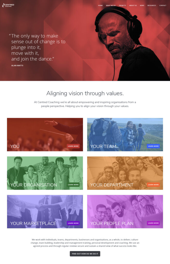
The idea behind the branding was for a more professional look and feel, although not overly corporate. There needed to be a measure of personality and an approachability for new clients, the double ‘C’ device was given a more softer style along with the word mark and typography to hint at a more organic feel.